What if you try creating your art with a 4-value scale, instead of the typical 10-value scale.
Painting - or otherwise fashioning - a 10-value scale has been an exercise in many art classes I've taken. It can be intimidating, and didn't feel valuable to me. Oh, I understood the importance of learning about values, yet I was never really sure I ever applied the learnings afterwards, intimidated as I was by such a range of values on the scale.
Yet, the value scale definitely has, well.... value. Understanding how our value choices create depth in our pictures, add dimension, or impact through contrast, are important to our designs. Referencing and finding my way through a 10 value range, however, is overwhelming and intimidating.
Recently I listened to a two different master artists discuss the 4-value scale. This scale ranges from very light to very dark, with just 3 values in between - the idea was to use the dark and light, and 2 of the 3 middle values. What a welcome notion to me, uncomplicated, easy to follow and implement.
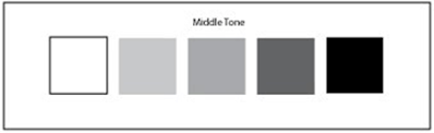
Both master artists suggested this simplified scale would be instrumental in ensuring we include the much-needed contrast and thus higher impact, and backed up this intimation with several examples of the 4-value scale used in many famous paintings. I was sold. And, yes, indications are it's already helping my own art.
And I then realized that several visual and fibre artists I know who create stunning art are using this same scale, whether consciously or not.
A few additional tips, while we're on the topic:
- when using a reference photo, change it to black & white, it's much easier to see the values
- squinting also helps to define values

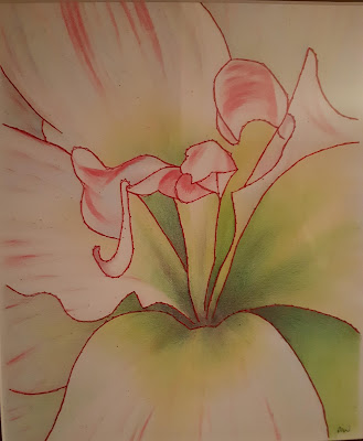
- The darker values in this amaryllis are what gives it form, giving the illusion of the petals curving downward into the centre. Lighter values would have left a very flat picture. There is in fact very little "white" in this white amaryllis. It's the values that give it form.


Hi Anne, that's a great idea. Quilters often work with dark, medium and light. It's simple but effective. Thanks for this article.
ReplyDeleteKeeping it simple really does make life easier doesn't it. My new motto LOL.
ReplyDelete