Who hasn't run into challenges at times when creating art. Too much detail, too busy, lacking a focal point, flat and lacking depth are just some of the roadblocks we may encounter. Others are colours that don't work well together, lack of cohesiveness, parts that don't connect. Can you relate to this?
At times I will backtrack and rip out stitching or paint over parts I feel I've bungled. We all have art that goes through an ugly stage before it becomes pleasing, re-working areas, not always sure if fixative steps will actually fix what wasn't working.
It takes a lot of practice to improve and know what to alter and what will work, how to create harmony, rhythm that is pleasing, repetition without tedium. Understanding the fundamentals of design can help.
At a recent online playdate hosted by the Out of the Box Fibre Artists, we learned all about using stripes to create a design. More specifically, the focus was on the power of rhythm & patterns of stripes. None of us had realized just how much there was to learn about the history of stripes or that there is a whole book dedicated to this very topic.
Our first task was to choose our fabric colours - 2 or 3 side by side on the colour wheel, plus the complementary colours (or neutrals). I choose 2 yellows (a soft yellow and a bright yellow), a bluish grey and a deep blue. Okay, so yellow and blue are not complementary, but I liked how these colours worked together as I auditioned them.
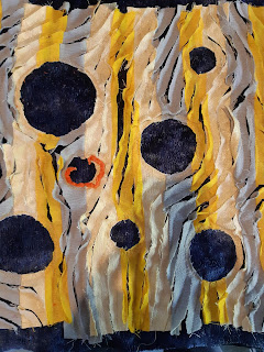
Next, we cut, laid out and sewed our stripes together in our chosen colours to create a 16x16 square. Then the fun part: creating patterns and movement with the stripes by cutting, rearranging, deconstructing or whatever our hearts desired. I chose to cut out areas to make circles, then sew curves diagonally around the circles to create movement, using the sew 'n slash technique of cutting between the sewn lines from one edge to another.
Alas, it was clear that my piece was dull, even with the circles and movement. Not what I had envisioned.
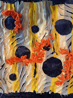
After trying on other colours to enliven the piece, I stumbled on some orange fun yarn in my stash - the perfect complementary colour to contrast with the strong blue and also next door to the yellow on that side of the colour wheel, just like the instructions had suggested.I had to decide where to place the orange, but that was not intuitive to me. We were of course creating under pressure as it was part of a playdate and we were presenting our progress in just a short time. Creating on demand I find a challenge at times. So random placement was what I decided to do, just to get the colour in there. But it didn't help. It was still flat, only now with pops of colour unconnected to the overall design.
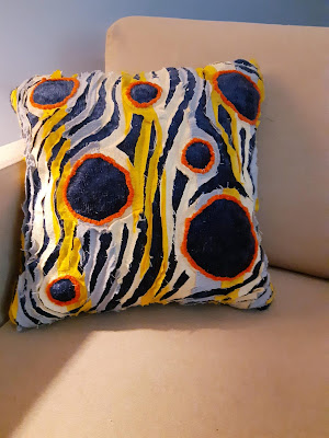
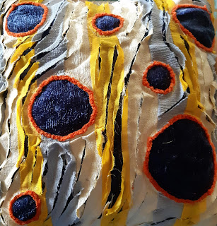
After the playdate, when I'd lived with the piece for a few days, it occurred to me the orange would make a good outline for the blue circles. This juxtaposition of complementary colours was the answer.
And the lightbulb continued to glow: balance was also lacking. I decided to trim parts of the yellows and grays to emphasize the dark blue, creating balance and more consistency in the widths of the stripes, and also to balance against the prominent blue of the circles. This resulted in a cleaner look, simpler and less cluttered.
Looking back at the changes I made, the design principles involved in this composition are:
- Pattern
- Movement
- Contrast
- Harmony
- Balance
 Ta-da! Overall I'm pleased with how this turned out and decided to turn it into a cushion. It now has a place of honour in my little reading chair.
 Improv playdates such as this are wonderful for opening us up to new ideas, self reflection, and learning far more than we thought. Thanks to an insightful Out of the Box member for coming up with this idea so we could explore and experiment and see where this would take us.


No comments:
Post a Comment