This is an update to my post earlier this week on my textile art challenge. I've been doing a little bit most days, and this piece as part of my new Daily Textile Practice has taken an interesting turn.
I've sewn on a few bits and cut through the layers of some fabrics to get some movement in the piece. I also added a fabric with a pattern I wasn't fabric, but one which I did a bit of eco-printing on - the colours seemed to be a good fit.
Sometimes a piece seems to take a lot of work and many layers before we feel it coming to life, before it turns into a dynamic art piece that reflects the message that we want to convey. This is a very normal part of the creative process, yet one that many people can get hung up on. As one art teacher has so rightly pointed out years ago "art has to go through an ugly stage before it becomes beautiful". It's taken years of art-making for me to learn patience with the progress and building of layers.
For this particular textile piece, I was expecting some construction as well as de-construction, that I would be taking two steps forward and one step back, aa and that at times I would feel some frustration at progress.
But stepping back to allow the next steps to come to us is important.
"...What I normally do is just leave it and let it marinate. Then [I] either go back to it and think, "Oh, you know what, that bit of the lyric is OK but I need to fix it," or write a complete new set of lyrics. But I think everyone gets the block from time to time."
Can you relate to this? And this isn't just a name of someone we don't know, but a real artist we are all familiar with.
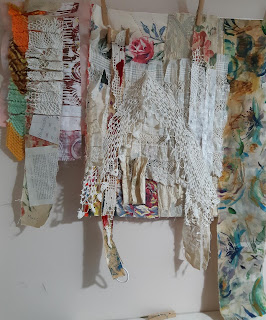
As I worked on my piece, I was feeling that while the colours were harmonious, I was a long way from creating a dynamic look.
Then, while tidying my studio, I came across 2 painted/mixed media papers done in a class a few years back, mostly paper, with some stitching, but never finished. I had kept them in case one day, you know, I would find the use for them.
One I thought was the right fit - shown here with the houses - I have loved making art of buildings over the years, and this one to me added a bit of sense of home. And yet it wasn't as harmonious as I first thought it would be. The colours were a bit off, as was the scale, throwing the whole look somewhat off balance


Do you agree with my choice? Here are the photos of the abstract one. I've included black & white photos too which are better at showing off the darks and lights.


No comments:
Post a Comment