Showing posts with label design principles. Show all posts

ADDING SOME CONTRAST - MY DAILY TEXTILE CHALLENGE

This is an update to my post earlier this week on my textile art challenge. I've been doing a little bit most days, and this piece as part of my new Daily Textile Practice has taken an interesting turn.

I've sewn on a few bits and cut through the layers of some fabrics to get some movement in the piece. I also added a fabric with a pattern I wasn't fabric, but one which I did a bit of eco-printing on - the colours seemed to be a good fit.
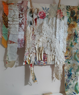

Sometimes a piece seems to take a lot of work and many layers before we feel it coming to life, before it turns into a dynamic art piece that reflects the message that we want to convey. This is a very normal part of the creative process, yet one that many people can get hung up on. As one art teacher has so rightly pointed out years ago "art has to go through an ugly stage before it becomes beautiful". It's taken years of art-making for me to learn patience with the progress and building of layers.

For this particular textile piece, I was expecting some construction as well as de-construction, that I would be taking two steps forward and one step back, aa and that at times I would feel some frustration at progress. 

But stepping back to allow the next steps to come to us is important.

A quote from an interview with Paul McCartney that I read recently can really help:

"...What I normally do is just leave it and let it marinate. Then [I] either go back to it and think, "Oh, you know what, that bit of the lyric is OK but I need to fix it," or write a complete new set of lyrics. But I think everyone gets the block from time to time."

Can you relate to this? And this isn't just a name of someone we don't know, but a real artist we are all familiar with.

As I worked on my piece, I was feeling that while the colours were harmonious, I was a long way from creating a dynamic look. 

Then, while tidying my studio, I came across 2 painted/mixed media papers done in a class a few years back, mostly paper, with some stitching, but never finished.  I had kept them in case one day, you know, I would find the use for them.

One I thought was the right fit - shown here with the houses - I have loved making art of buildings over the years, and this one to me added a bit of sense of home. And yet it wasn't as harmonious as I first thought it would be. The colours were a bit off, as was the scale, throwing the whole look somewhat off balance


So I tried the second art paper, more of an abstract - which at first I was reluctant to use - I feel it fits so much better. The colours are harmonious. It adds some contrast, which adds interest and has potential to make some areas pop. 

Do you agree with my choice? Here are the photos of the abstract one. I've included black & white photos too which are better at showing off the darks and lights. 


DESIGN PRINCIPLES HELP GET YOUR COMPOSITION RIGHT

Who hasn't run into challenges at times when creating art. Too much detail, too busy, lacking a focal point, flat and lacking depth are just some of the roadblocks we may encounter. Others are colours that don't work well together, lack of cohesiveness, parts that don't connect. Can you relate to this?

At times I will backtrack and rip out stitching or paint over parts I feel I've bungled. We all have art that goes through an ugly stage before it becomes pleasing, re-working areas, not always sure if fixative steps will actually fix what wasn't working. 

It takes a lot of practice to improve and know what to alter and what will work, how to create harmony, rhythm that is pleasing, repetition without tedium. Understanding the fundamentals of design can help. 

At a recent online playdate hosted by the Out of the Box Fibre Artists, we learned all about using stripes to create a design. More specifically, the focus was on the power of rhythm & patterns of stripes. None of us had realized just how much there was to learn about the history of stripes or that there is a whole book dedicated to this very topic. 

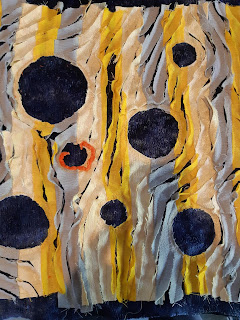
Our first task was to choose our fabric colours - 2 or 3 side by side on the colour wheel, plus the complementary colours (or neutrals). I choose 2 yellows (a soft yellow and a bright yellow), a bluish grey and a deep blue. Okay, so yellow and blue are not complementary, but I liked how these colours worked together as I auditioned them. 

Next, we cut, laid out and sewed our stripes together in our chosen colours to create a 16x16 square. Then the fun part: creating patterns and movement with the stripes by cutting, rearranging, deconstructing or whatever our hearts desired. I chose to cut out areas to make circles, then sew curves diagonally around the circles to create movement, using the sew 'n slash technique of cutting between the sewn lines from one edge to another.  

Alas, it was clear that my piece was dull, even with the circles and movement. Not what I had envisioned.   

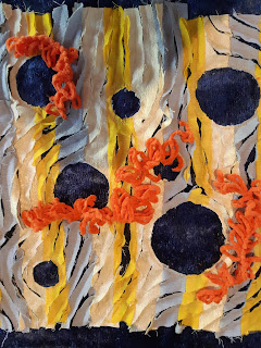
After trying on other colours to enliven the piece, I stumbled on some orange fun yarn in my stash - the perfect complementary colour to contrast with the strong blue and also next door to the yellow on that side of the colour wheel, just like the instructions had suggested.

I had to decide where to place the orange, but that was not intuitive to me. We were of course creating under pressure as it was part of a playdate and we were presenting our progress in just a short time. Creating on demand I find a challenge at times. So random placement was what I decided to do, just to get the colour in there. But it didn't help. It was still flat, only now with pops of colour unconnected to the overall design. 

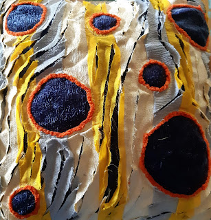
After the playdate, when I'd lived with the piece for a few days, it occurred to me the orange would make a good outline for the blue circles. This juxtaposition of complementary colours was the answer. 

And the lightbulb continued to glow: balance was also lacking. I decided to trim parts of the yellows and grays to emphasize the dark blue, creating balance and more consistency in the widths of the stripes, and also to balance against the prominent blue of the circles. This resulted in a cleaner look, simpler and less cluttered.

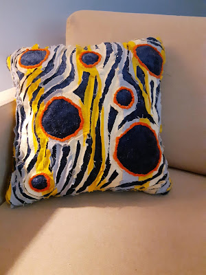
Looking back at the changes I made, the design principles involved in this composition are:

  • Pattern
  • Movement 
  • Contrast 
  • Harmony 
  • Balance
Ta-da! Overall I'm pleased with how this turned out and decided to turn it into a cushion. It now has a place of honour in my little reading chair. 

One final observation: It dawned on me that several of us had challenges with the design side. This playdate was not about learning the design principles, but rather was about having fun playing with pattern - stripes specifically - as the basis for a design. We did not know in advance the steps we would be taking, nor the outcome, so there was no pre-planning, no opportunity to form a vision of what the finished piece would look like at the end of the day. 

Improv playdates such as this are wonderful for opening us up to new ideas, self reflection, and learning far more than we thought. Thanks to an insightful Out of the Box member for coming up with this idea so we could explore and experiment and see where this would take us. 

Link:

Related Post:


TYVEK EXPERIMENTS FOR 2026

Although I'm not a quilter, I am a fibre artist and do a lot of machine sewing, mostly random, improvised lines and some free motion. My...